a look into my skill set…
psst… these are some of my favorites





want more? scroll on!
marshalls case study
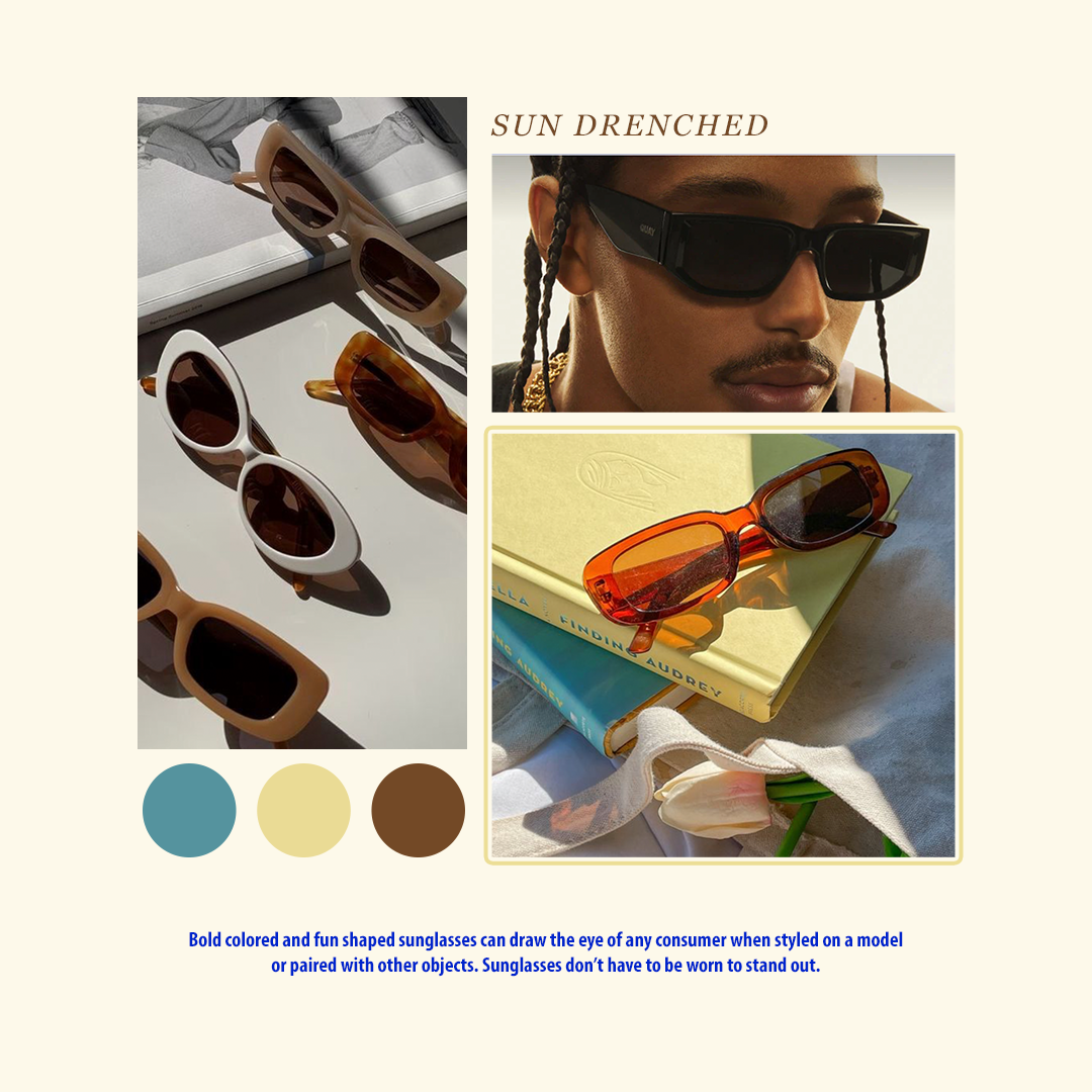
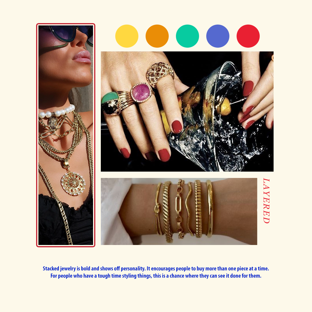
For a recent job interview, I was asked to create a few deliverables for the TJX brand, Marshalls. I was given a bunch of footage to trim down into a reel for IG/TikTok for a Spring clothing line. On top of that, I was asked to create a mood board for accessories, and how I would use them in a social space.

what i’ve been up to recently
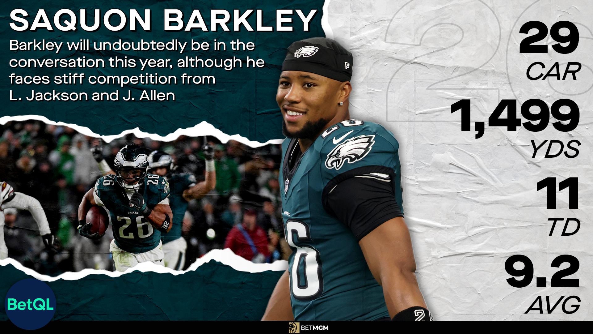
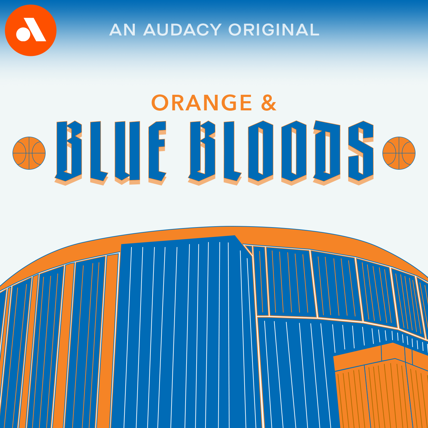
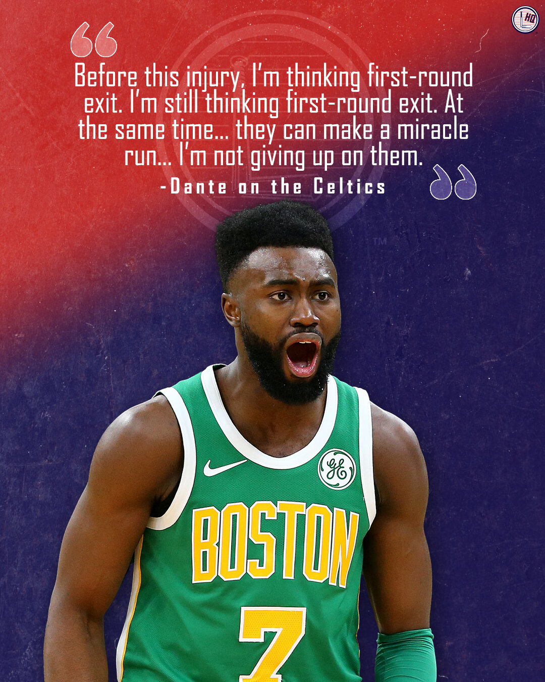
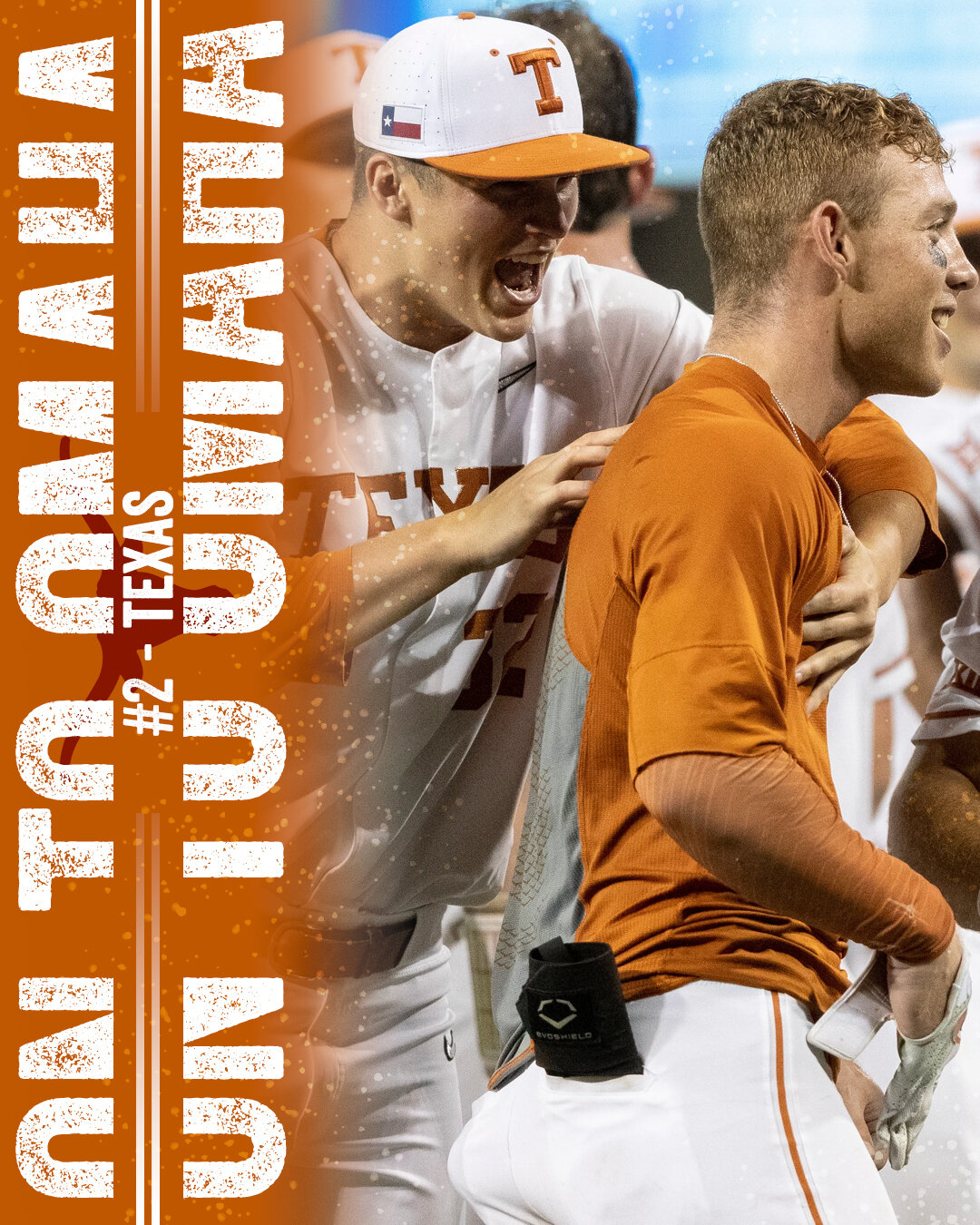
Since 2022, I’ve worked for a company called Audacy, Inc. I was hired as a graphic designer, and have since become an amateur video editor and animator. My job mainly consists of creating show graphics for radio stations across the United States, as well as creating templates for our social media team to use. Below, you will see designs that I have created for Chicago’s 670 The Score, along with some of the templates I have made for our team to use. The videos display how the 670 channel graphics animate on and off the screen.




Lumberlend - Home of the Original Bat Mug
Lumberlend became famous on Tik Tok in 2021. Throughout my time there, they amassed over 3 million followers on their social media platforms. I was hired in April of 2021 as a graphic designer, where I create designs that were used on the platforms. This was also the company where I worked as a social media manager and apparel designer (check below for apparel).


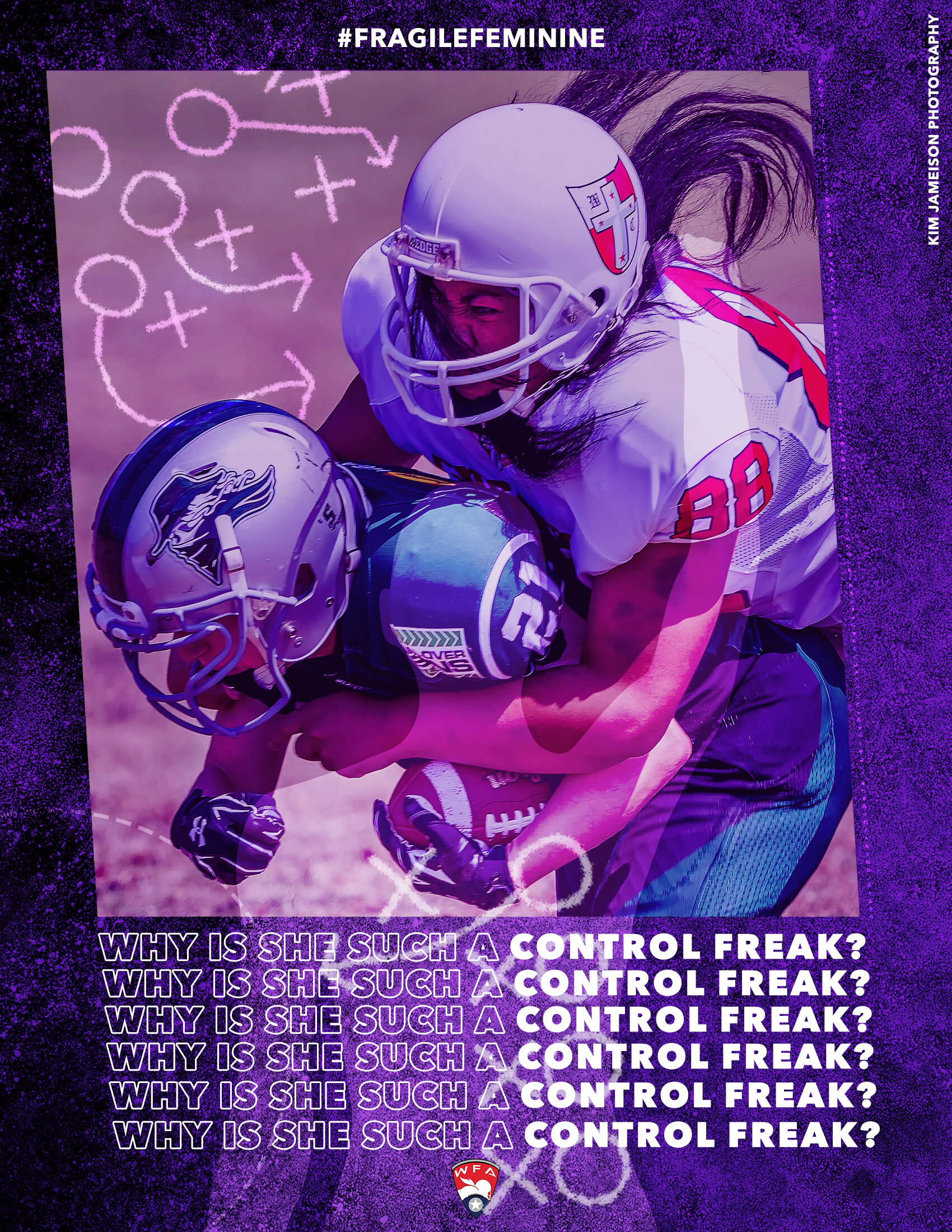
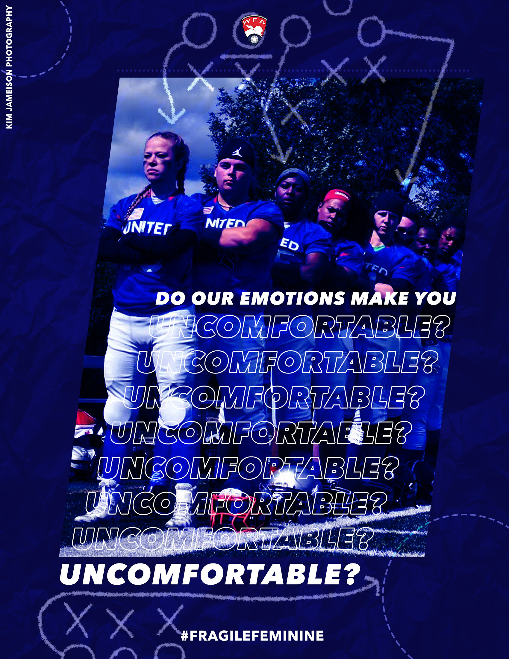
senior thesis - equality in sport
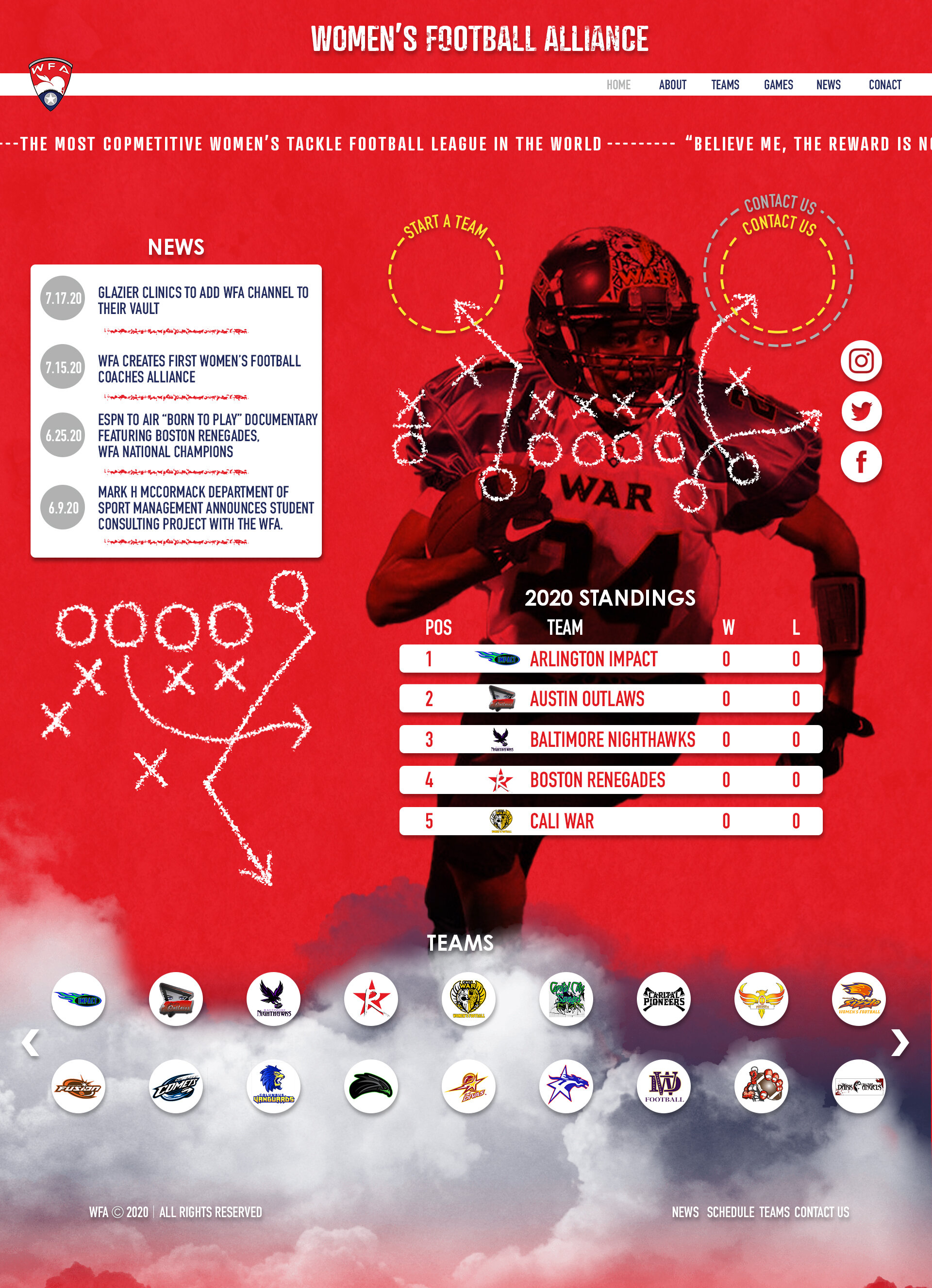
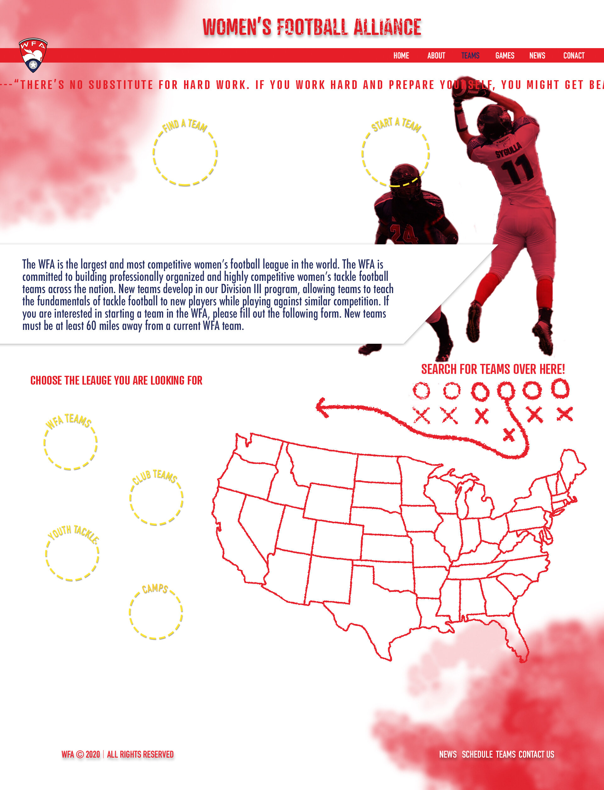
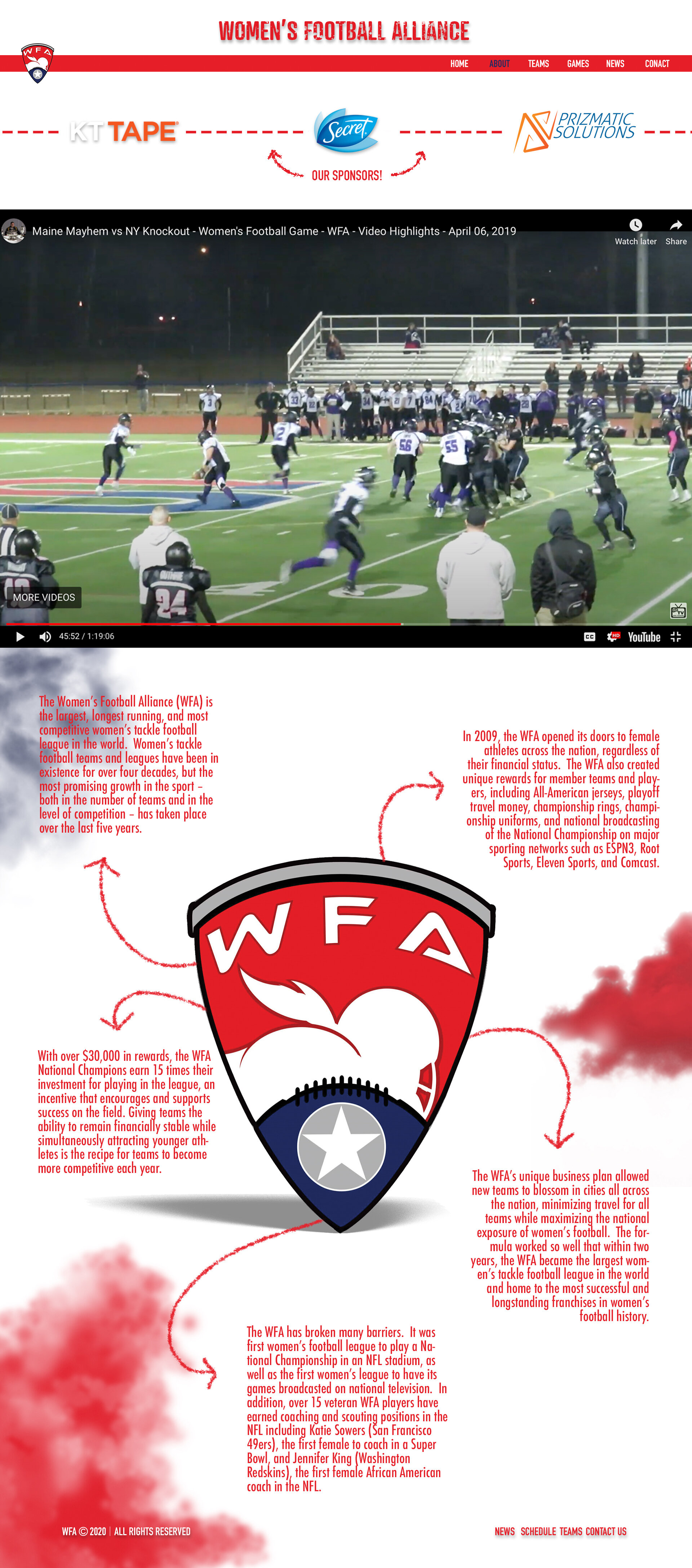
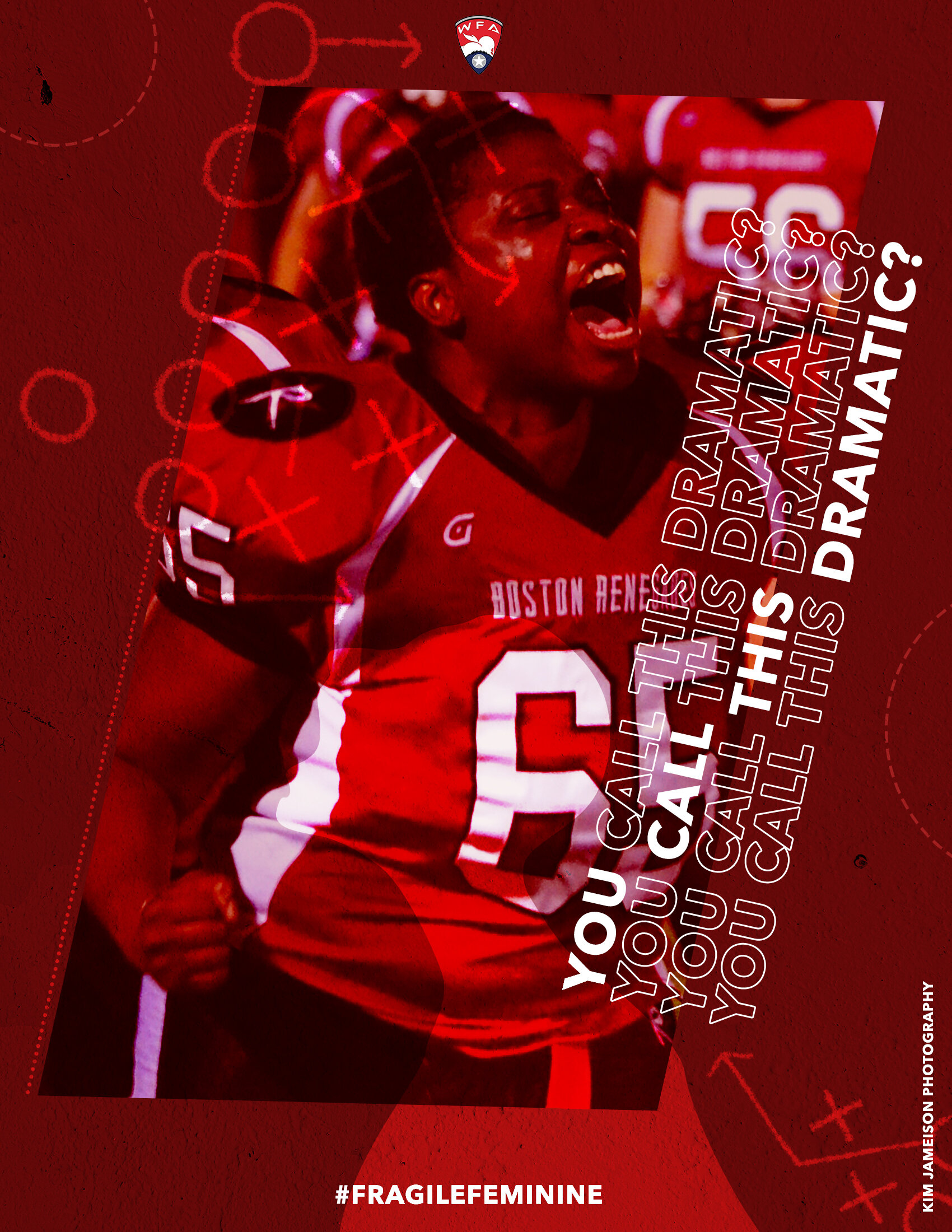
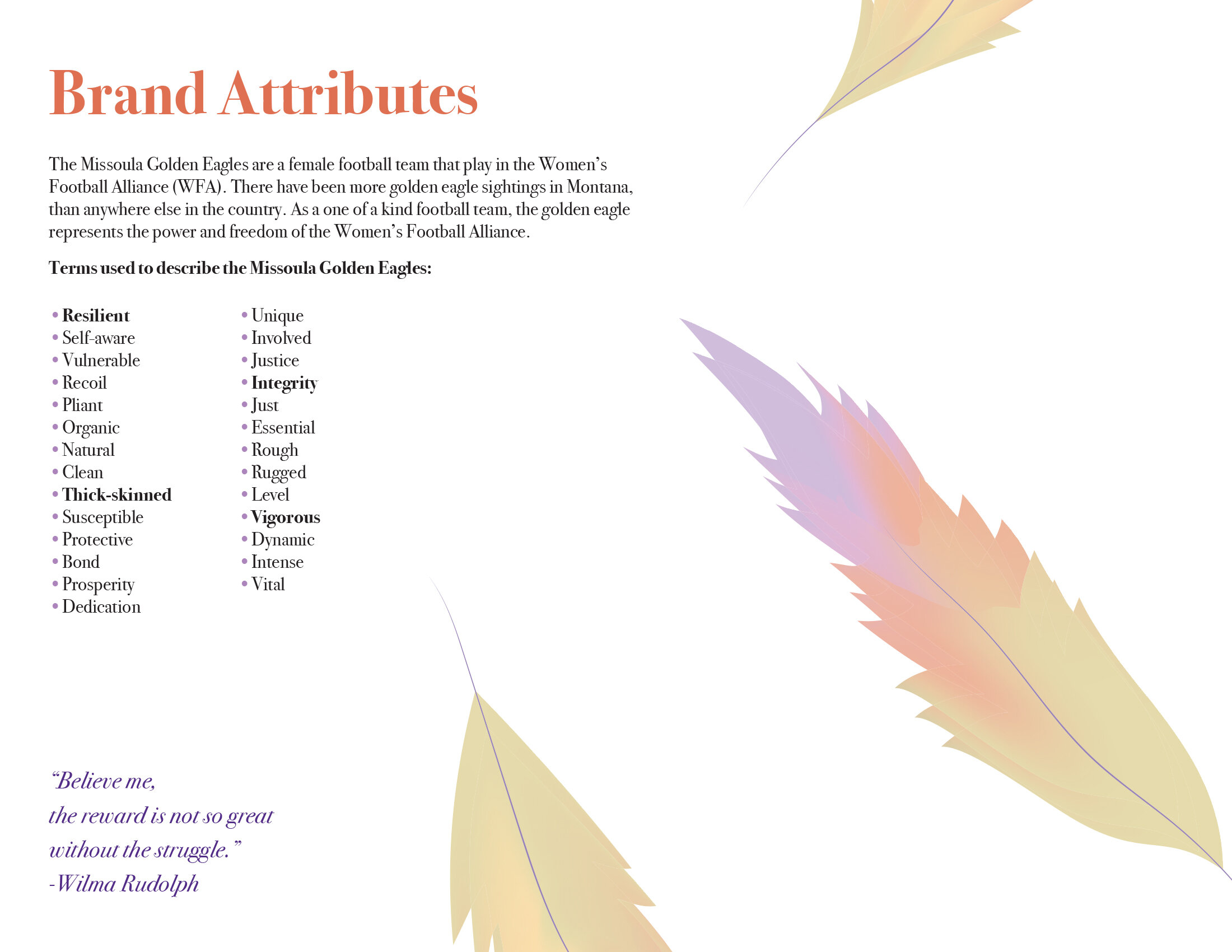
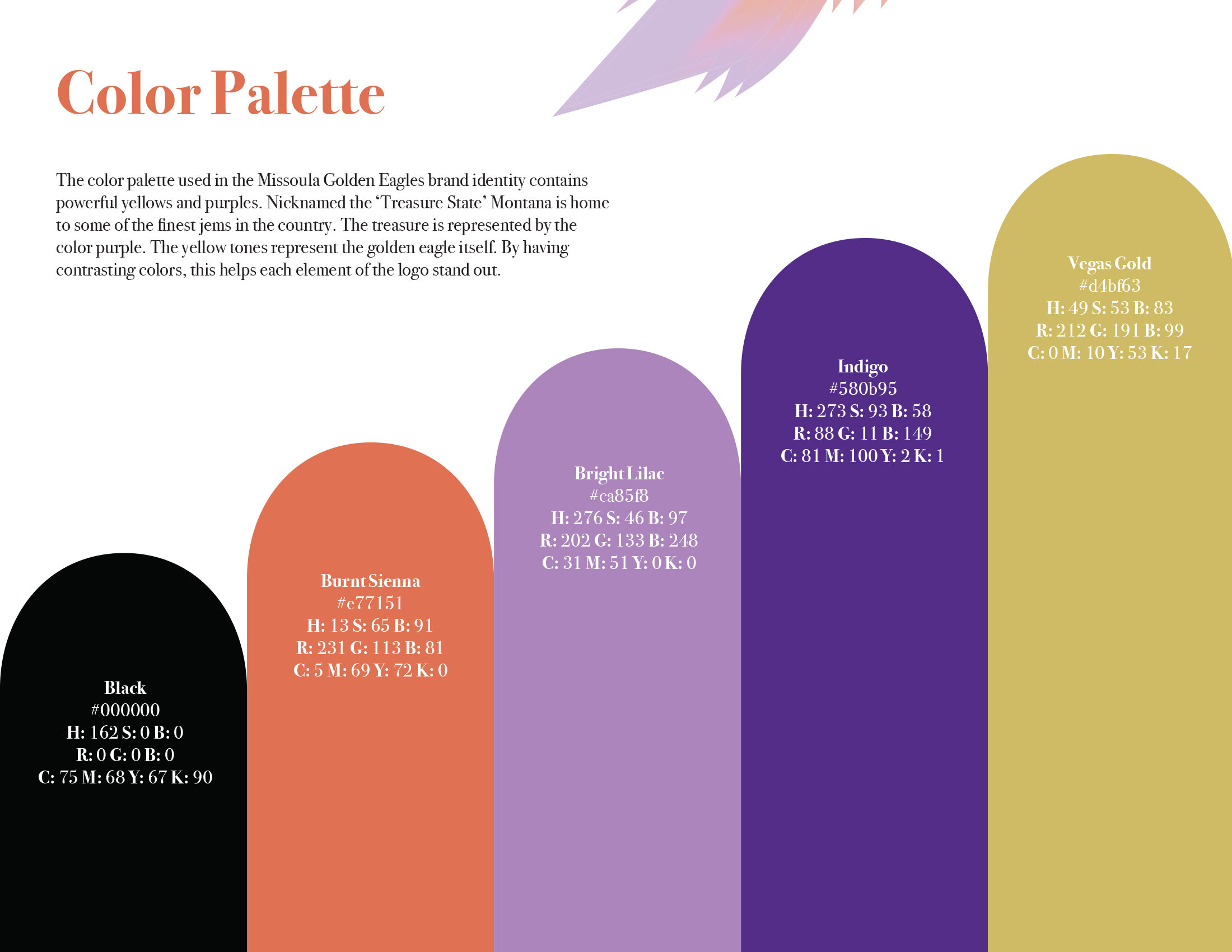
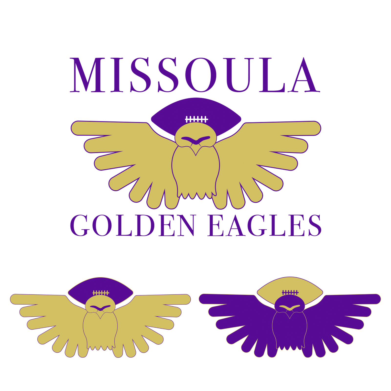
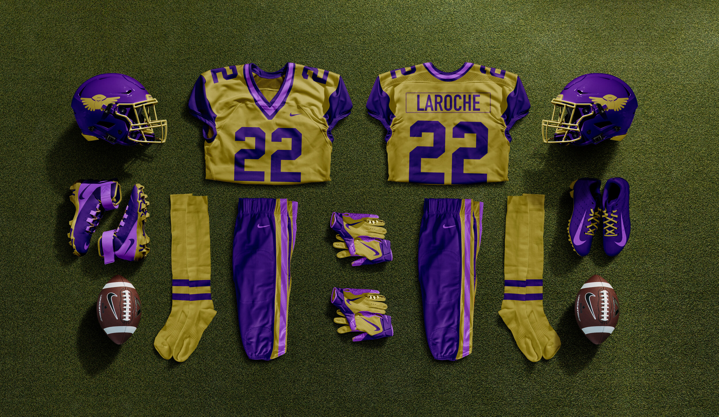
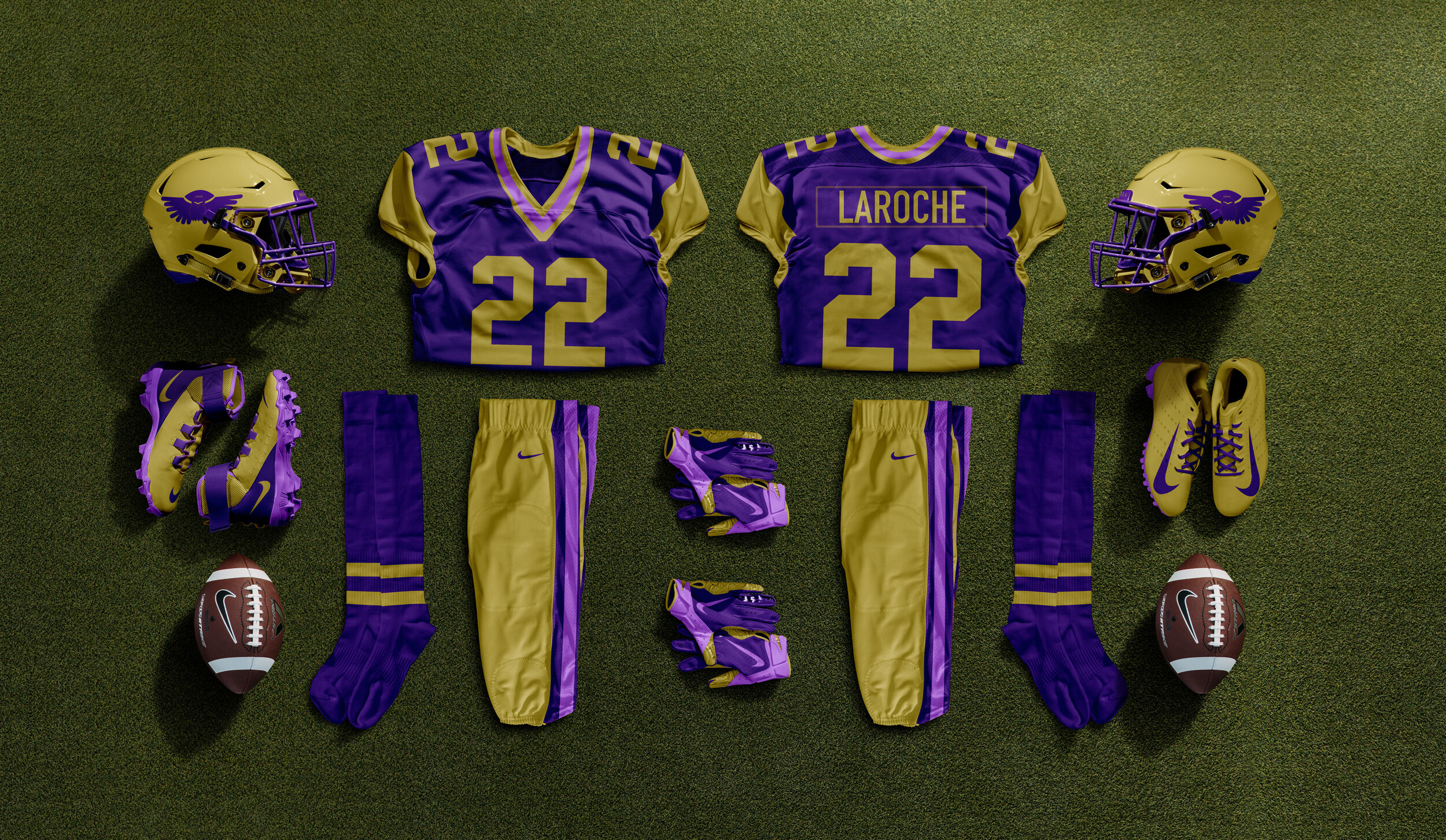
For my senior thesis, I wanted to focus on equality in sport. For the first part of my thesis, I did extensive research on famous advertising campaigns that focused on the topic of equality in sport. I chose to study the “Dream Crazy” campaign by Nike, the “Sisters in Sweat” campaign by Gatorade, and the “All Strength, No Sweat” campaign by Secret. Each of these campaigns helped influence the second part of my thesis. Once I was finished with my research, I began designing four deliverables that focused more specifically on the lack of female representation in the sports industry. My main focus was on the Women’s Football Alliance (WFA).
1 - Website 2 - Ad Campaign 3 - Missoula Golden Eagles. 4 - Uniforms 5 - Website Animation
apparel
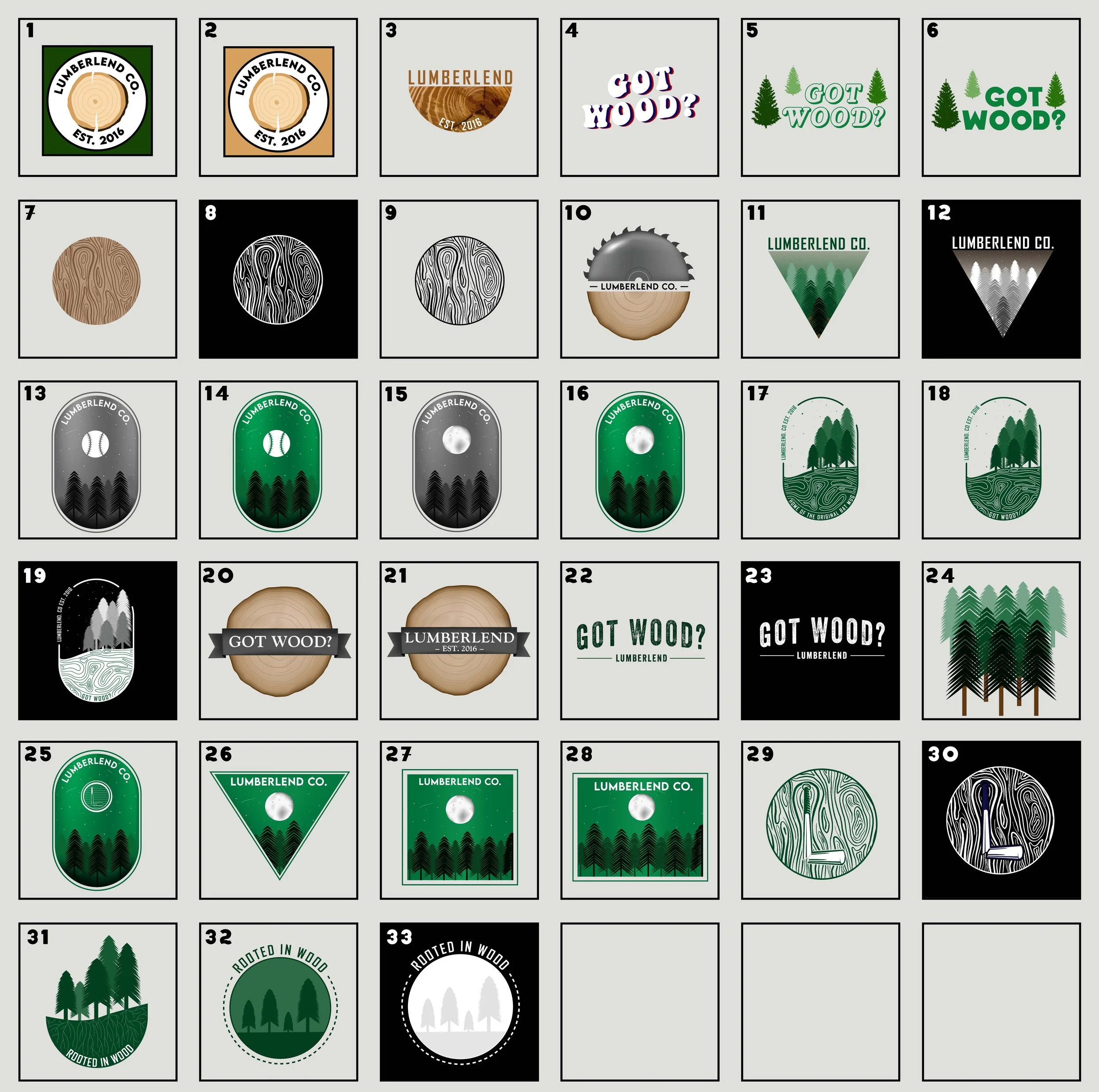
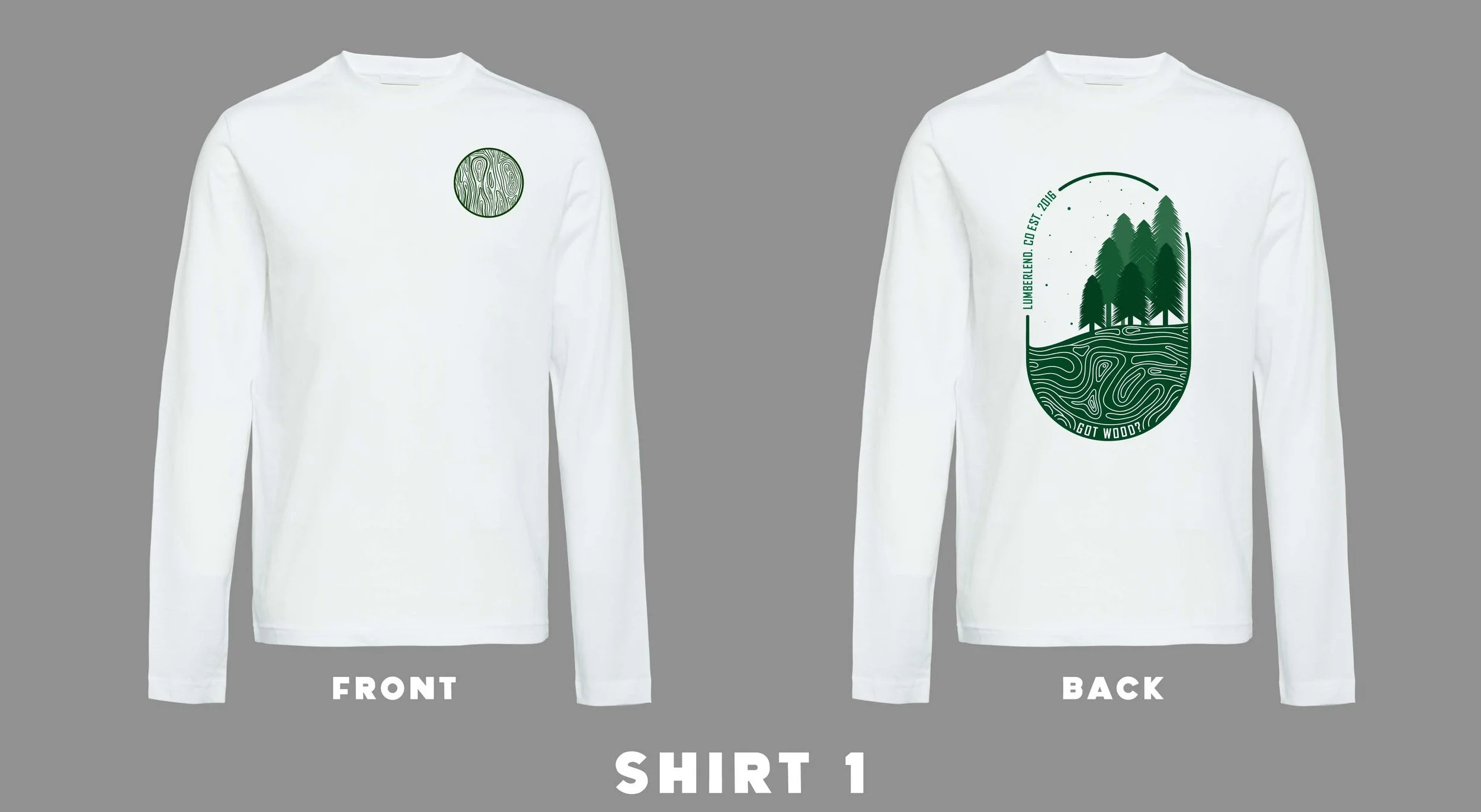
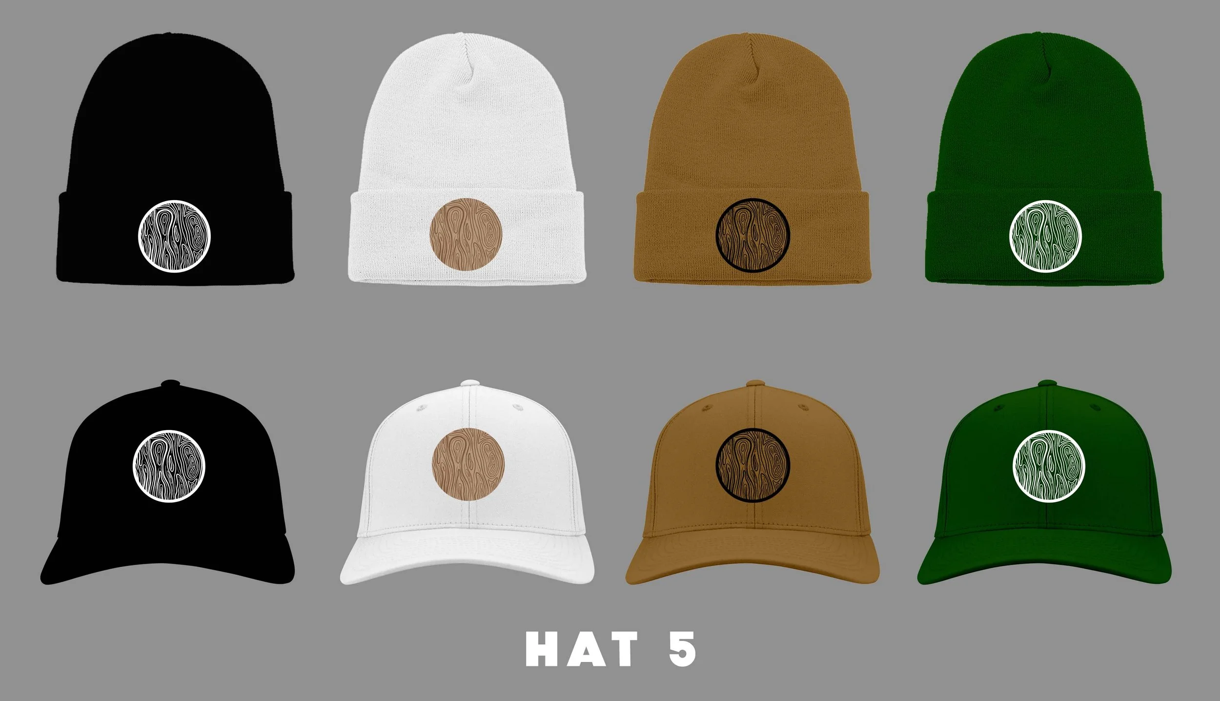
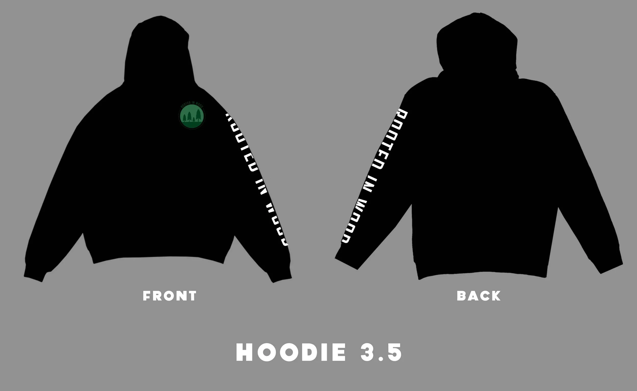
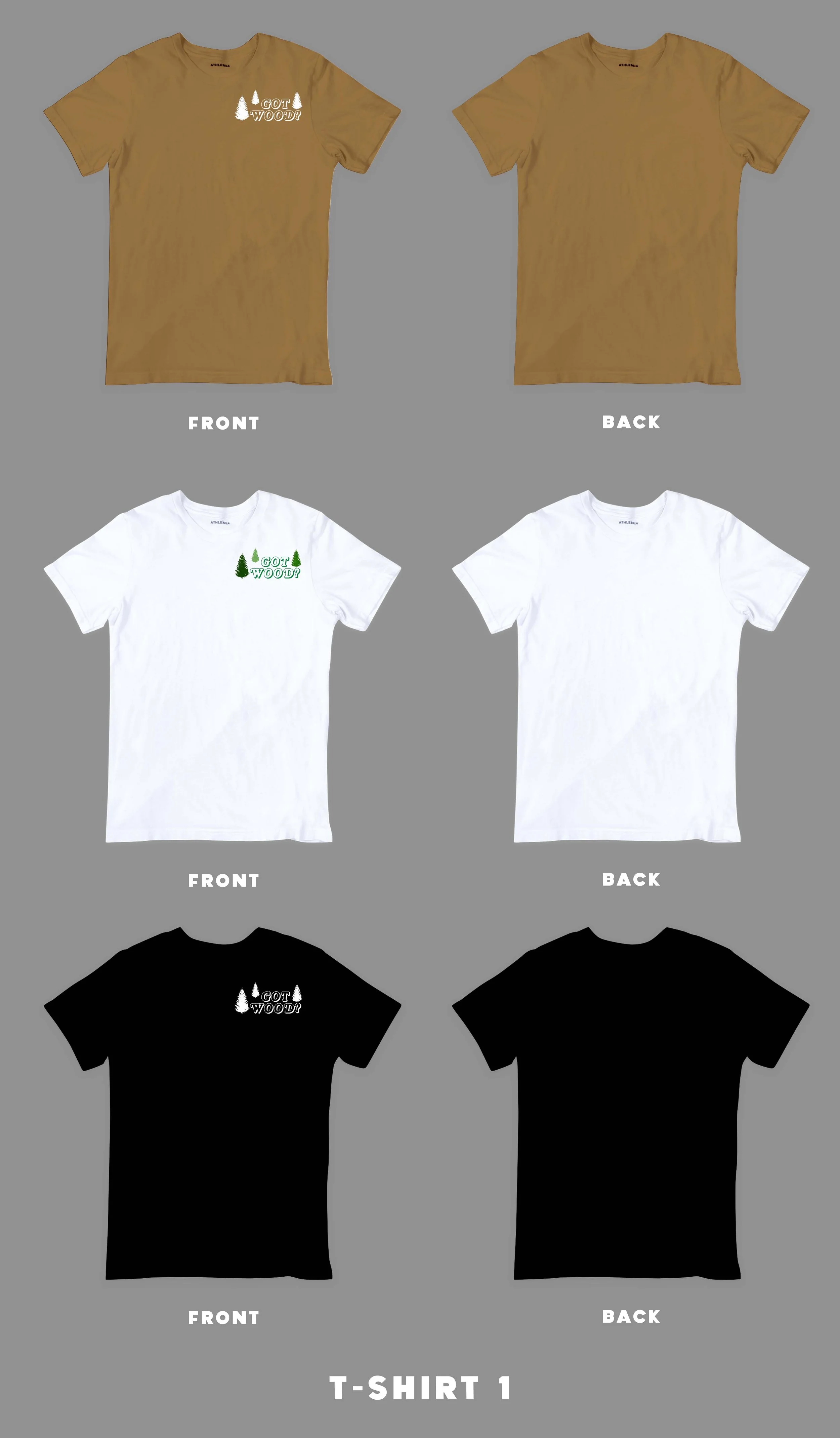
My first job in the graphic design world out of college was for a company called Lumberlend. I was hired as a social media graphic designer, but I was able to explore different types of design as I was there. I was asked to create a line of apparel, along with a narrative that I wanted to tell. I thought of this project as my first child in my career. Something I had raised from the beginning. Lumberlend was known for selling mugs made out of wooden baseball bats, and so I wanted to dive into the mug making process and break it down to its most simple form - wood. The Rooted In Wood line was born.
editorial design
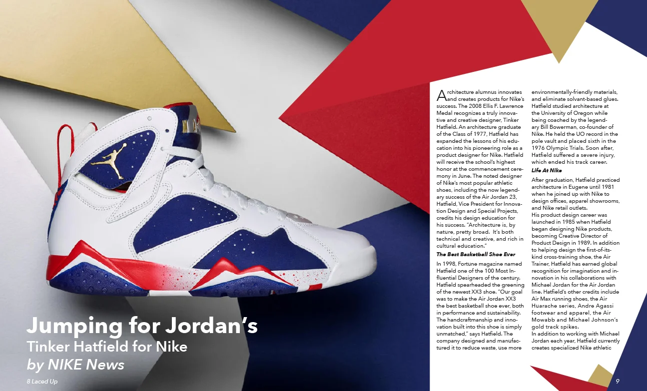
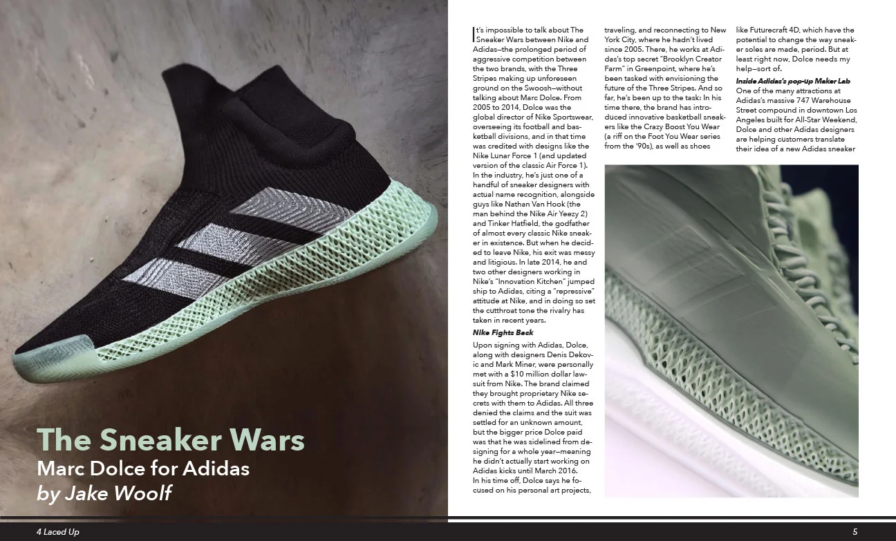
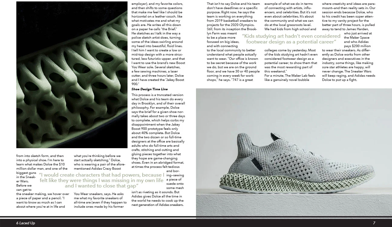
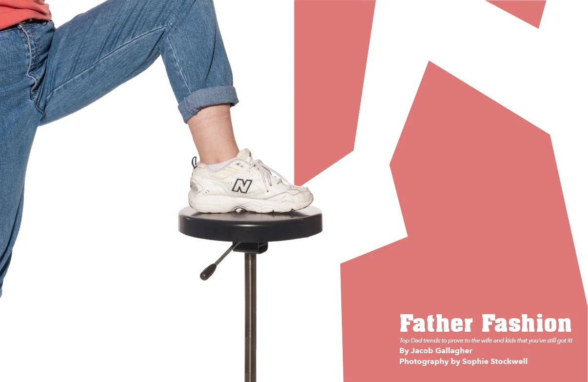
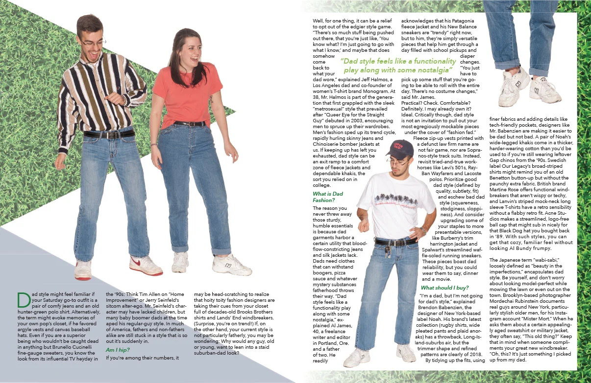
When I was in college, one of my projects was to create a magazine article about a subject I really enjoyed. I used to think of my self as a sort of sneaker head, and so I quickly decided what I wanted my subject to be. After I made my first article, I decided to make a few more. The second one in this series is for a magazine called Total Dad Move; a magazine that thought would be funny.
exhibit design
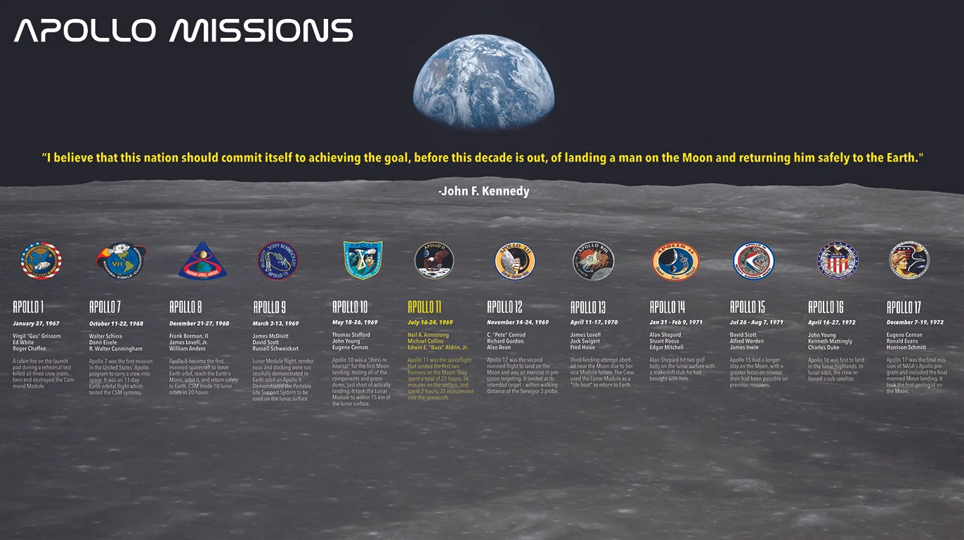
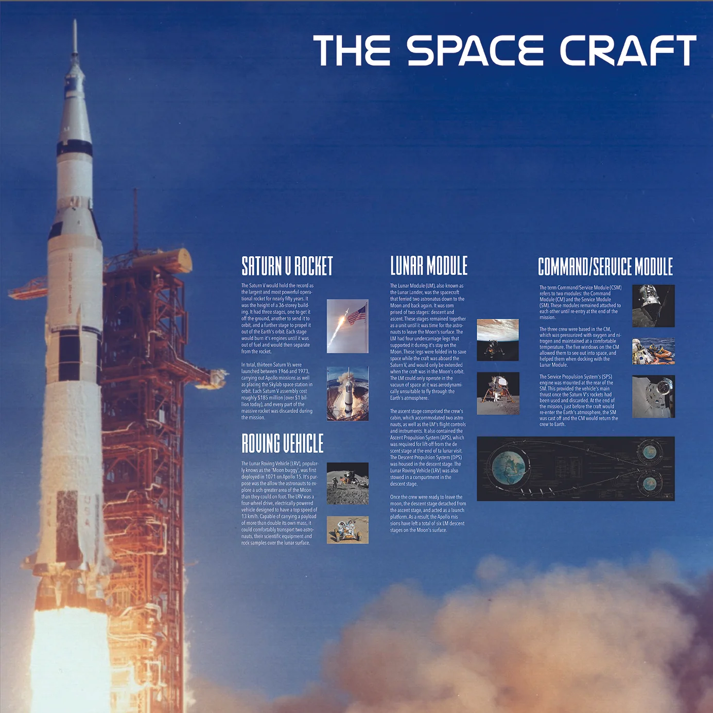
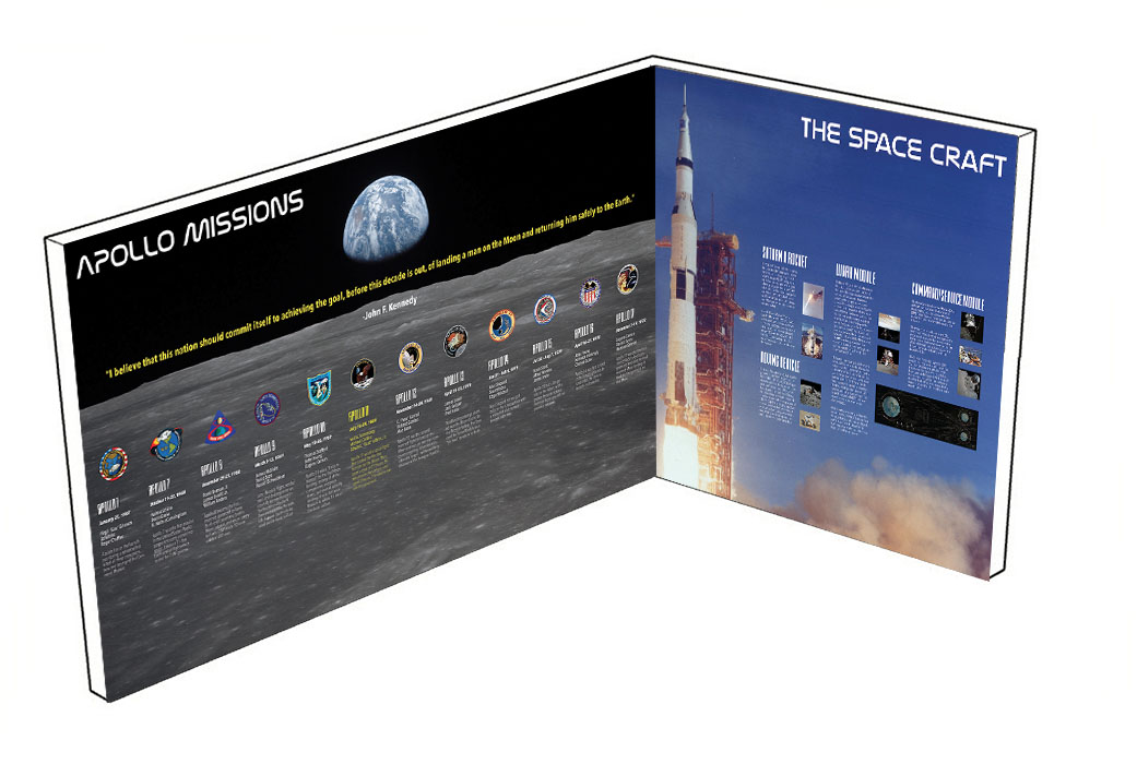
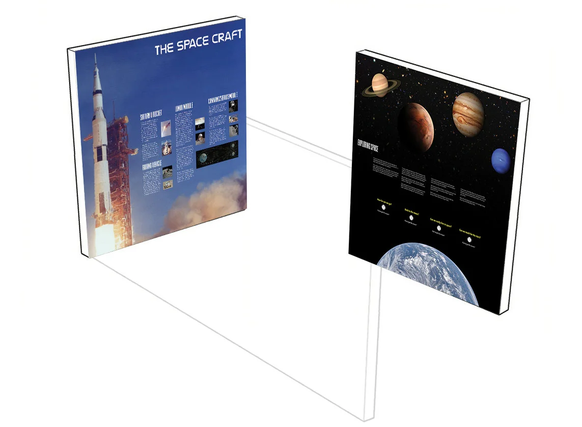
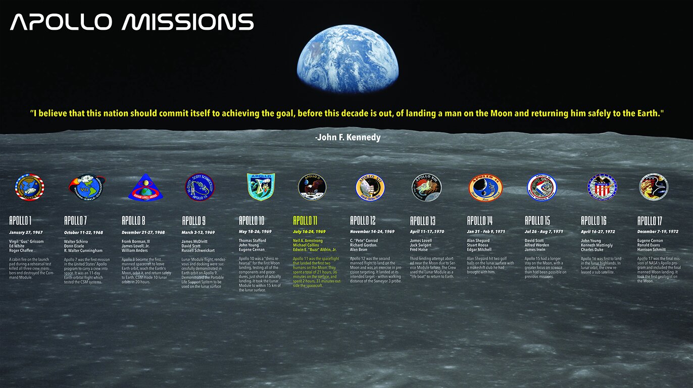
One of my first attempts at using typography in graphic design. I believe I was a sophomore in college, and I was taking Typography I. Our assignment was to create a museum exhibit on the Apollo Missions. I love outer space, and so I was extremely excited to execute this. I was really proud of myself after this one was completed. Would’ve loved to see it in person!
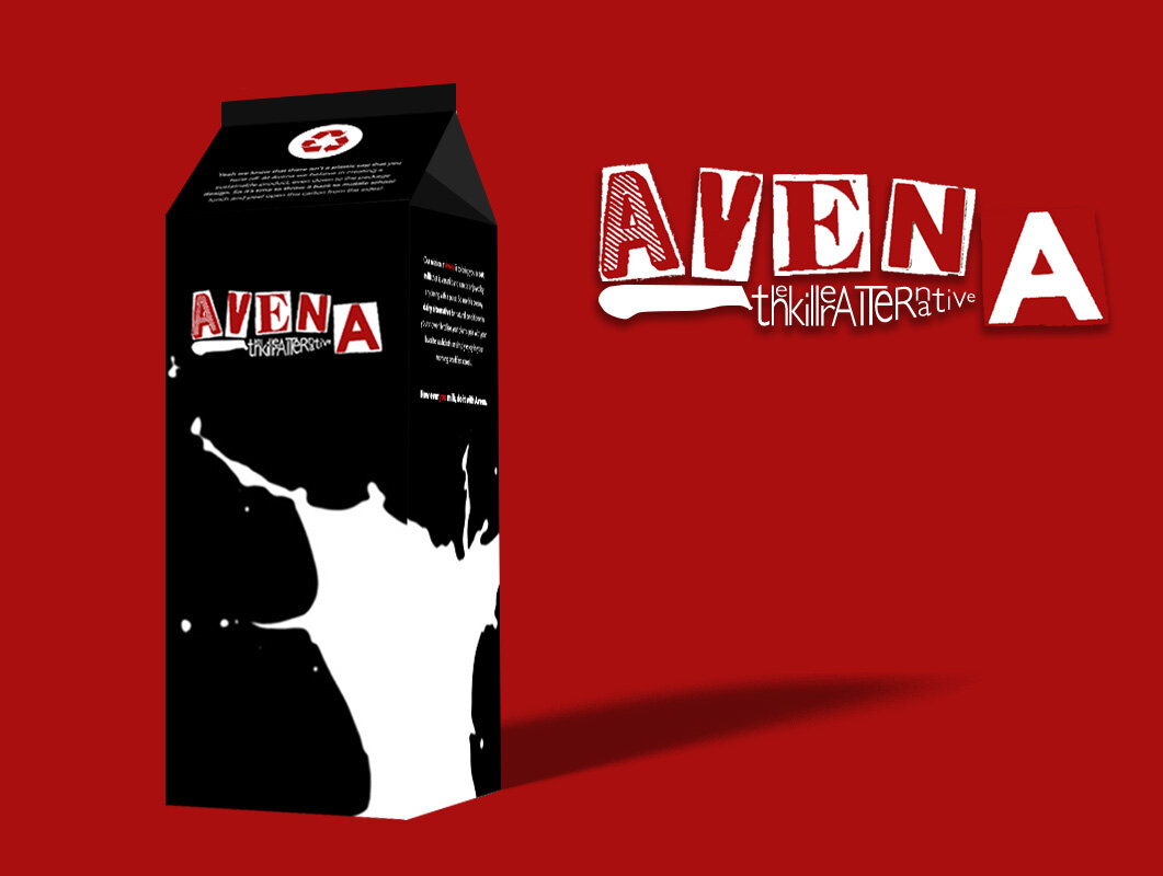
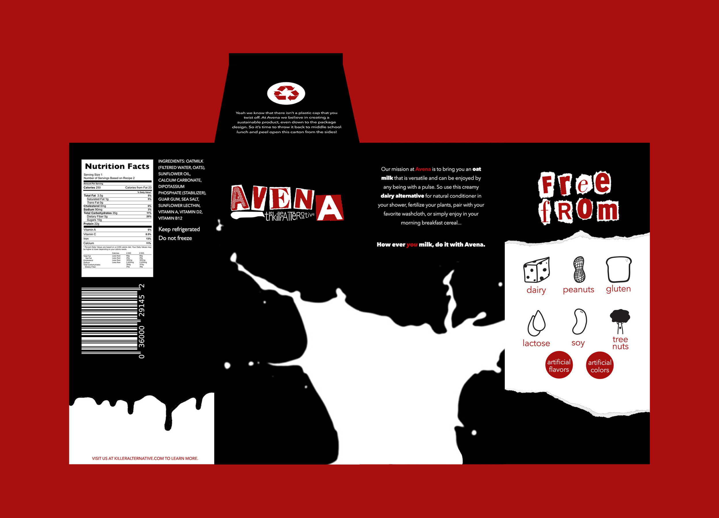
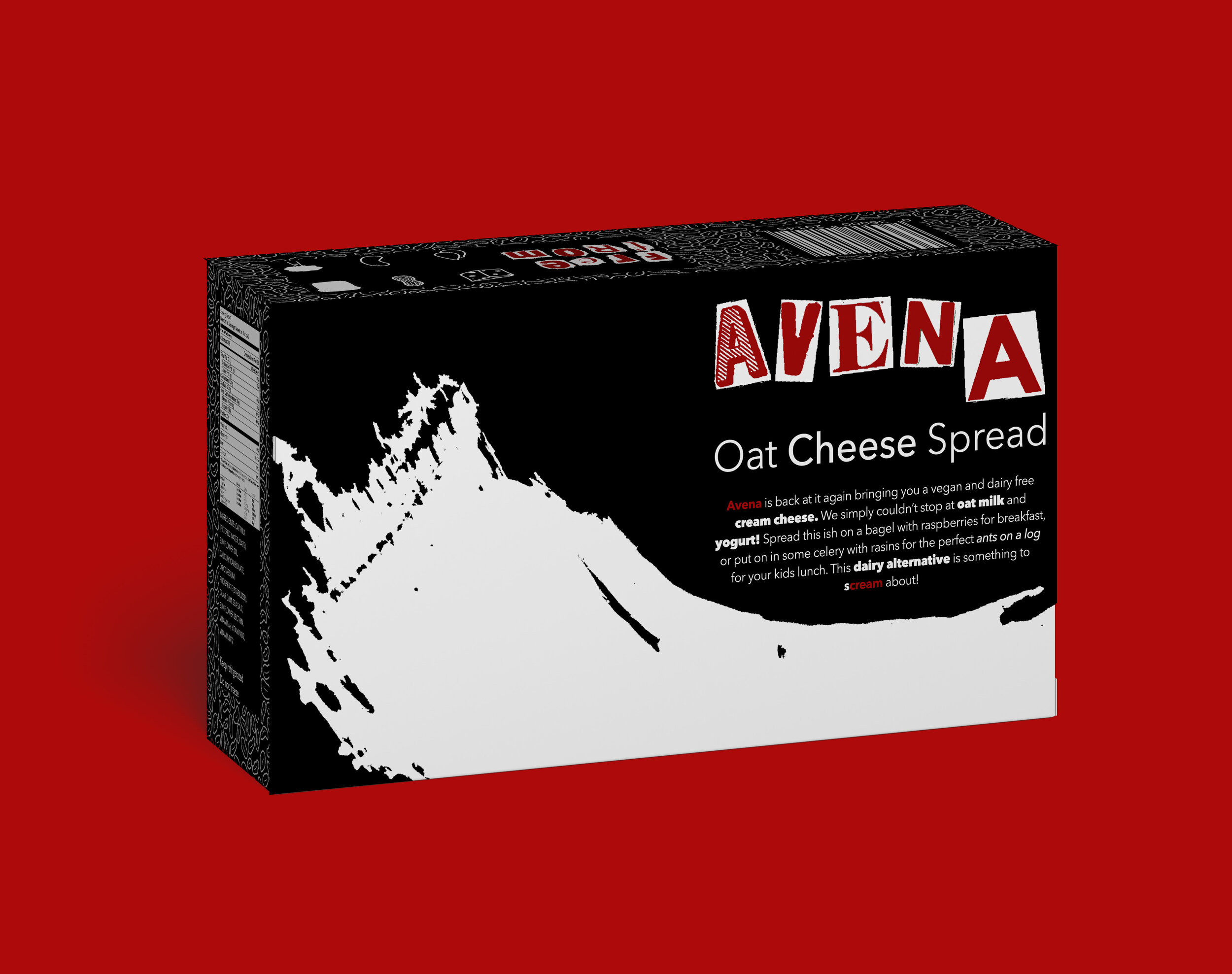
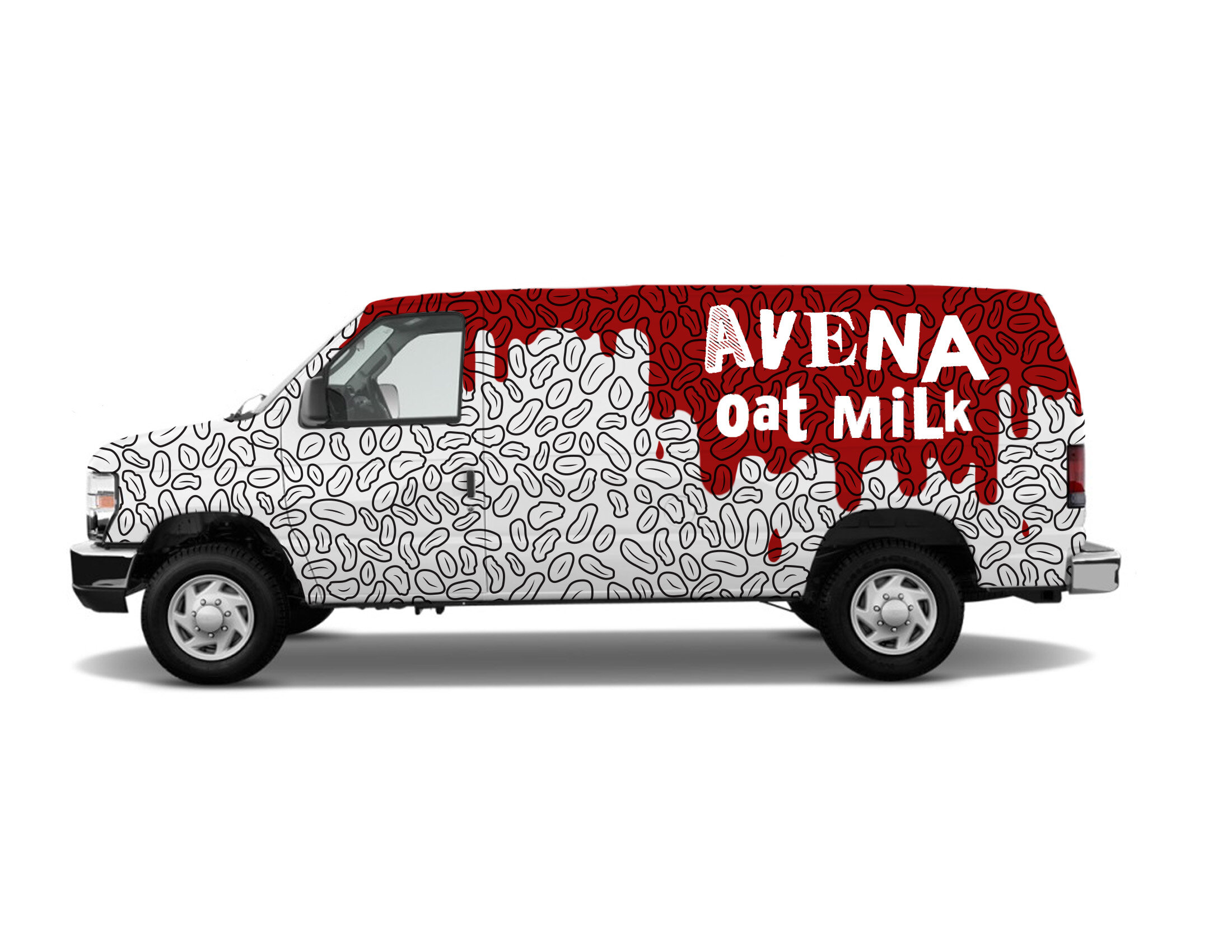
avena oat milk
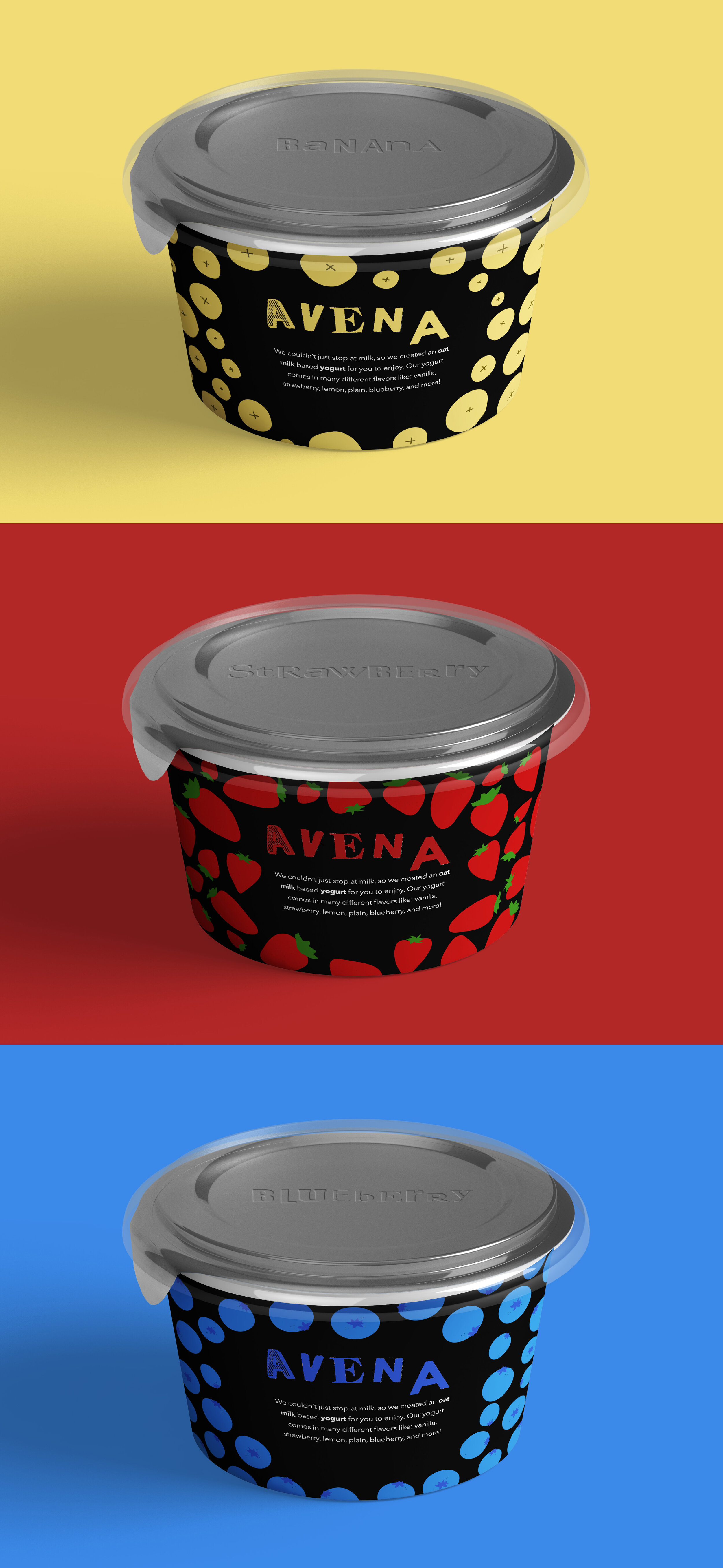
For my Junior Studio Design II class, we were told to rebrand a boring grocery store item. The item I decided to choose was oat milk! As someone who is very lactose intolerant, I wanted to chose a product that I would use. The oat milk brands that I researched were far from boring, but I knew I wanted to challenge myself to make a package design that was going to stand out in a cooler.
